I continued to learn more about how to use RShiny and its scripts. The most important thing I was learning was how to import data to manipulate in RShiny. My mentor sent me a Microsoft Excel sheet with made-up pieces of data. If it works on that data, then in theory, it should work on the actual data.
I spent the rest of the class studying control charts. A control chart is "a graph used to study how a process changes over time." On the chart, you plot three lines: the average, the upper control limit, and the lower control limit. I talked a little about this in the previous blog post. In this way, I can see if the data points are relatively consistent or are unpredictable. They include a template on how a control chart should look like.
There is a package in R called "qcc." That package will help me create an XmR chart, which is what I am coding. It is a control chart.
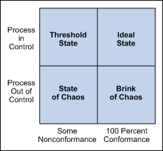
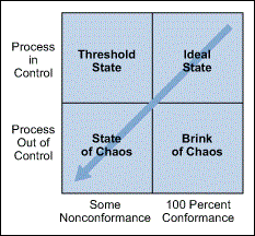
There are four process states for control charts: "the ideal, the threshold, the brink of chaos, and the state of chaos."
~ideal state- the process is stable and predictable over a period of time.
~threshold state- the process is predictable for the most part, though there are times when it is unpredictable
~brink of chaos state- it is out of control but it is not defective. The outputs are still in the requirements of the client.
~state of chaos state- it is out of control and it "produces unpredictable levels of nonconformance."
"There are three main elements of a control chart.
1. A control chart begins with a time series graph.
2. A central line (X) is added as a visual reference for detecting shifts or trends- this is also referred to as the process of location.
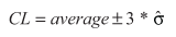
3. Upper and lower control limits are computed from available data and placed equidistant from the center line. This is also referred to as process dispersion."
Here is how to calculate a control limit: you estimate the standard deviation and multiply it by 3. Then you either add or subtract that from the average, depending on if you're calculating the upper or lower limit, respectively.
~WHEN TO USE A CONTROL CHART~
-When predicting the expected range of outcomes from a process.
-When determining whether a process is stable (in statistical control).
-When analyzing patterns of process variation from special causes (non-routine events) or common causes (built into the process).
-When determining whether your quality improvement project should aim to prevent specific problems or to make fundamental changes to the process. "
Sources Used:
https://shiny.rstudio.com/tutorial/written-tutorial/lesson5/
http://asq.org/learn-about-quality/data-collection-analysis-tools/overview/control-chart.html
https://www.isixsigma.com/tools-templates/control-charts/a-guide-to-control-charts/
Sources Used:
https://shiny.rstudio.com/tutorial/written-tutorial/lesson5/
http://asq.org/learn-about-quality/data-collection-analysis-tools/overview/control-chart.html
https://www.isixsigma.com/tools-templates/control-charts/a-guide-to-control-charts/
Comments
Post a Comment